It's Electric.
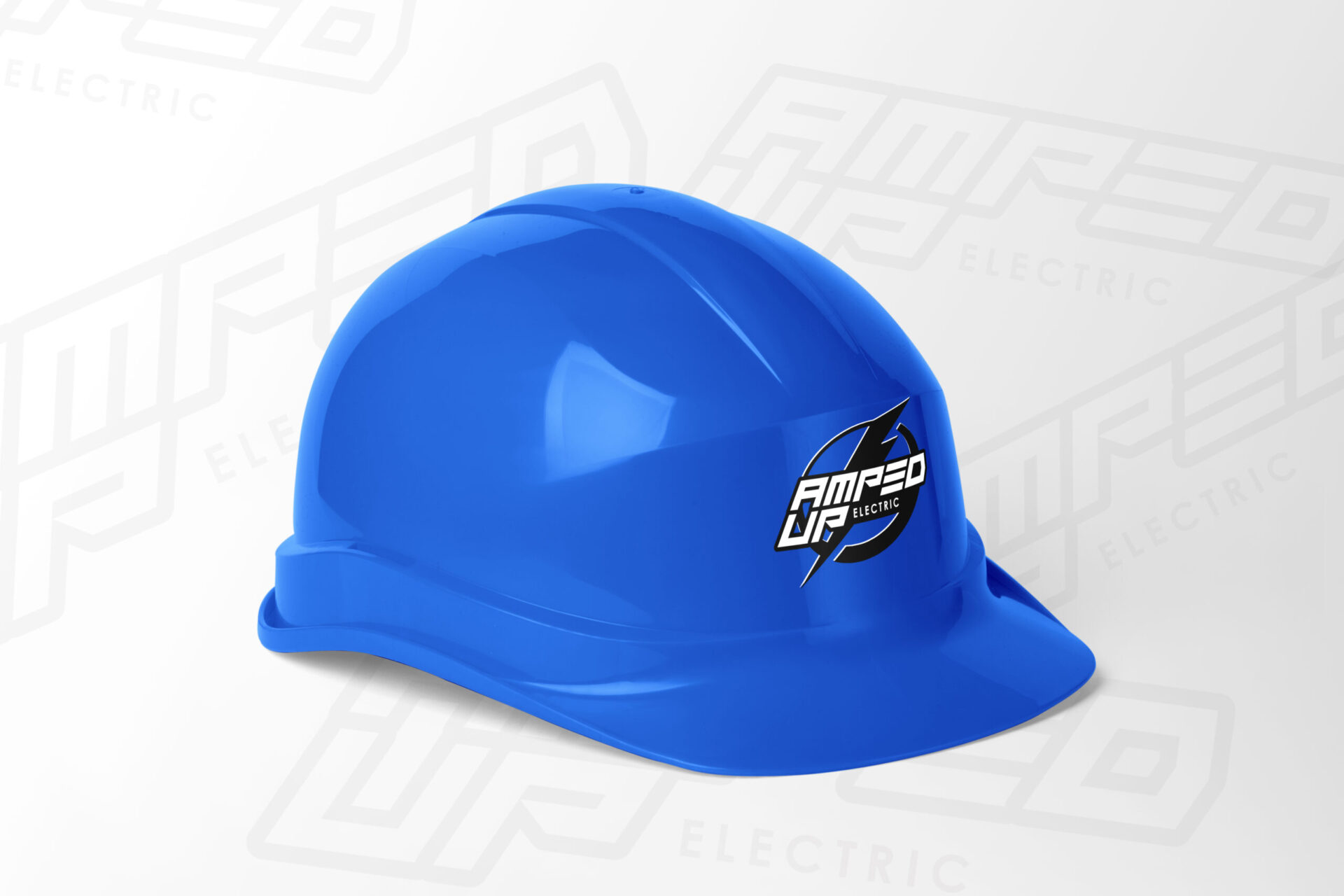
This client reached out to me to request a unique logotype design. The request included asks of a modern font, with a “Cobalt Blue” accent color. They also wanted to incorporate something related to basketball into the design.
After some thought, we settled on the half court layout being featured in the design. I integrated the half-court in the letter “D” in the acronym.
For added appeal, I also decided to use the texture from the basketball, and incorporate it as an overlay on another rendition of the logo. The texture serves as the brands main pattern.
I chose to mock the logo up in an office setting to give the client the feel of the agency, as well as what it might look like to see it in an office setting or meeting room with their potential clients.
